In the Spring of 2009 – my sophomore year at Notre Dame – I gathered a list of all of the black students enrolled at the University, alphabetized it by first name, chose one student per letter, took their photograph (along with a self-written statement), and made an alphabet book – turning an open-ended GDII assignment into a social commentary piece about my alma mater and its relationship with its black student population. As a young black student at Notre Dame who constantly blended both my Design and Sociology majors, this book was a subtle yet powerful way to criticize the lack of diversity on the Notre Dame campus (illustrated by the total numbers per letter) and suppress the myth of a “collective black experience” (through personal statements).
This Spring marks the 10th anniversary of An Alphabet Book (see original here). If selected for this creative residency, I would spend the coming year recreating it - using the campus' current black student body to examine how far the University has (or has not) come in its commitment to diversity and inclusion. With all of the heightened racial tension in this country over the last couple years, we have also seen a reemergence of black nationalism, especially with black millennials. I will explore whether this reemergence has evolved the conversation of race on this predominantly, white campus. Using Notre Dame as a microcosm of America, this book will also spark a larger conversation on how we as society continue to navigate race relations and whether or not any gaps have actually been narrowed.
Read the complete proposal for An Alphabet Book: Revisited.
Mock Spreads for An Alphabet Book: Revisited
Click image to view next. Text and Images FOR PLACEMENT ONLY.
Pia Guerra (Illustration); Dietmar Herbert (Black/White Male Portraits); Matthew Rice via Wikipedia (Main Building at Notre Dame)
A Digital Mood Board for
An Alphabet Book: Revisited
An Altered Book, Krystal Grows
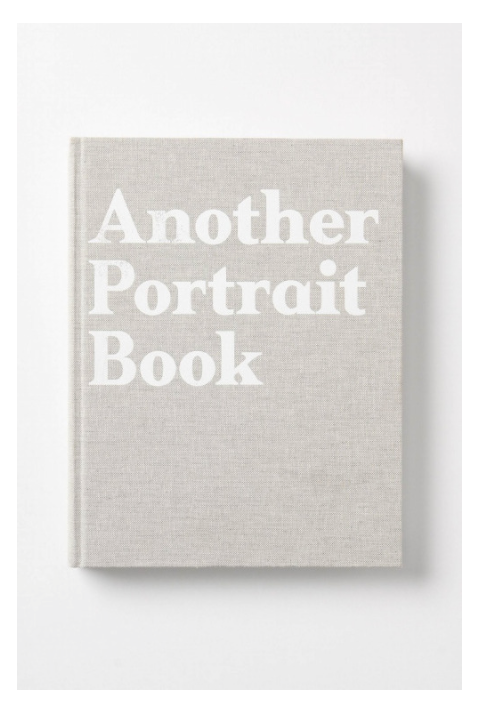
Another Portrait Book, Jefferson Hack
Lady with A Hat, Thomas Anthony - Color Palette Inspiration
The TIMELINE can be divided into six phases: (1) introduction, (2) collection, (3) design, (4) review, (5) production, and (6) realization.
ILLUSTRATION, (4) black-and-white line illustrations (similar to the styles below) will depict recent stories of racial discord on college campuses (i.e. Missouri student protest/boycott, racist fraternity chant at OU, nooses hanging from a tree at the University of South Alabama, etc) – helping to pace the story and set the tone.
LAYOUT, An Alphabet Book: Revisited will follow a similar progression as the original – showcasing a much more sophisticated, clean, and modern layout (as the examples below).
FINISHES, including printmaking techniques and unorthodox materials, in addition to paper, to help elevate the level of storytelling. For example, (1) embossing moments in each illustration, using touch to evoke a certain emotional connection between the depictions and the reader and (2) using clear acetate/vellum and silkscreen printing to show striking similarities between the new and original student statements. Click example image to view.
PHOTOGRAPHY, I will work with a photographer to capture stunning and raw portrait imagery of each student participant, mimicking the tone of each personal statement that they are positioned next to. A small handful of the participants will be photographed around campus, replacing their portrait image and visually connecting these students back to the University – an element I strongly regret not having in the original book. Photos below are inspiration/references.


