What was especially unique about this year was that this entire project was initiated and completed all while on lockdown. While I knew from the very beginning that there was a very good chance these tickets would never make it to our fans — which presented its own mental challenges — I was still committed to make something that represented this team, as well as the visual direction we are looking to take our Athletics brand. Once the revised schedule was announced in late August, the printed tickets were one of the many things that were canned in order to create more contactless interactions. While a bit disappointing, I am very happy with how they turned out and proud of all of the work that went into them.
As the world continues to dive deeper and deeper into digital, printed season tickets continue to remain a staple with our fanbase. Whether it serves as a keepsake to mark special memories with family and friends or a collectible to remember a special season, printed tickets are really important to our season ticket holders.
With the previous year’s theme revolving around our “125th Anniversary of Aggie Football” celebration, I really wanted this year’s tickets to further push the boundaries of the typical sports ticket aesthetic. The result was a set of art that was very type-forward while combining a muted color palette, abstract shapes, and clever uses of white space to create something really fresh.
Humanizing Our Student-Athletes
Our external team was tasked by the new senior administration to create content that humanized our student-athletes. For the theme of these season tickets, I wanted to emphasize the principles of our football program on each ticket and feature the student-athlete that the coaching staff felt best represented that particular principle.
To further drive the theme, we had each of the student-athletes write an original quote defining that principle. This is an idea that came from one my team members through the feedback meetings I facilitated with various folks from our external staff.
Muted Color Palette, Subtle Textures & Abstractness
The white, dotted pattern was used to create abstract shapes to illustrate and suggest elements of the background (i.e. field, pylon, fans, stadium lights).
Experimental Type
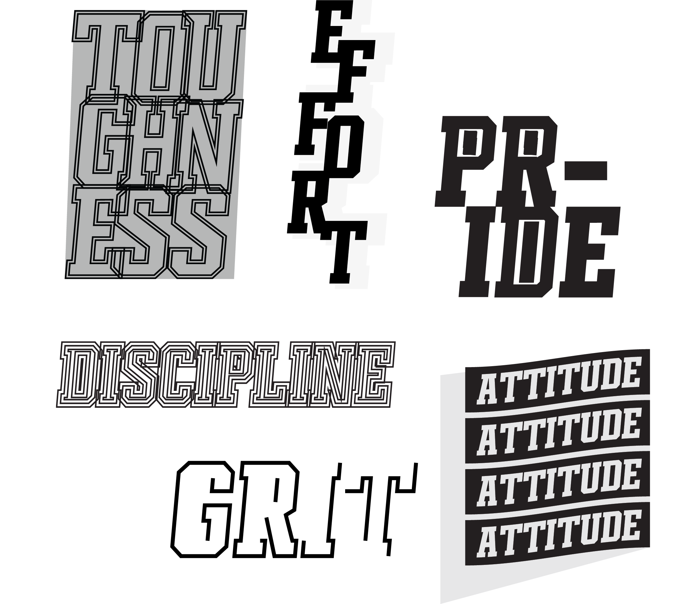
I repurposed the type treatments from the main art and created a pattern to use on other elements of the ticket package, i.e. highlighting the wristband that is used to differentiate the regular tickets from the premium area tickets.
Concept Art Presented to External Staff
Final Artwork
[ … ]


